Last Updated on August 31, 2020
Images remain one of the most critical parts of effective e-commerce.
If you are selling on Amazon, your customers have a lot many options at their fingertips. Before your customers make a choice, they will look at the images.
If you want to beat your competition, you cannot compromise on high-quality images.
You need to understand that when people see the product in person, they have all sorts of questions which can be answered immediately. Like:
Is the fabric seem cheap?
Is this going to be itchy?
Does the size fit me?
When shopping on Amazon, the images are the salesforce. As customers are not in touch with the actual product, they make their buying decision based on the images in front of them.
Interestingly, the image quality of your products can make a difference between ranking you on page 1 or page 5 of the Amazon search query.

Here are the tips for optimising product images on Amazon.
- Highlight The Main Image
Amazon has some specific rules regarding the main image.
It is essential that you review the seller support page to keep a tab on the guidelines as they can change.
While the subtle changes are introduced from time to time, the fundamentals of listing the product have remained the same for the last 10 years.
Only Show the Product
Your main image cannot have any text, props, borders or items to show the scale of the product. It has to be only the image of the product you’re selling.
Pure White
If you think you can use any white as the background for your product, then you are wrong. Amazon wants you to use a particular type of white, which is (RGB 255, 255, 255).
This is the requirement because it makes the product look like they float with the interface.
You can hire some services to edit your photos for a small fee.
Close Up
Another requirement is that the product in the main image must take up 85% of the image.
Images that are cropped loosely make your product appear small when displayed in the search all the ads.
This can result in a less click-through rate or CTR as well as reduce the amount of organic traffic on your listing.
- Fill All Image Slots
You might have most probably seen their most productive two or three images, while it might seem basic, but for most categories, Amazon offers seven or more image slots.
To get focus on your products and rank higher, you should add as many images as you can. The first six or seven images are critical as they provide important product details to the customers.
If you add a video to your product listing, then it will be shown in the seventh slot of your listing.
Make sure that you are not just posting pictures of the product from the front and back and packaging, but also providing pictures to show scale, functionality and use types.
Furthermore, infographic images can also be a powerful tool for conversion on Amazon.
- Size Matters
The size of the image plays an important role in how your product is viewed on Amazon.
Too small images not only appear pixelated but can also be disabled to be zoomed on desktop.
Amazon recommends that your images should be at least 1000 pixels on the shortest side so they can be zoomed. Proportion is also an important aspect, the recommended aspect ratio for the product detail pages is 1:1, or square.
You can also upload rectangular images, but inconsistent image size makes your product look less professional. Also remember, Amazon adjust the images for thumbnails that appear in the search results and ads. High pixel images appear professional in thumbnails.
Changing the images to the proper proportion cannot only increase the CTR but also unit session percentage by over 25%.
- Optimize Your Bullets
Titles and bullets play an important role in indexing and ranking, which is why Amazon puts a lot of emphasis on them.
Protect images have a very low impact on bringing traffic to your listing, they remain objective is to help you with converting the traffic.
Traffic to your listing is brought by the title and description that you add. Especially for mobile users, the only content that appears over the fold is the product title and images, which is why you should always add informative images.
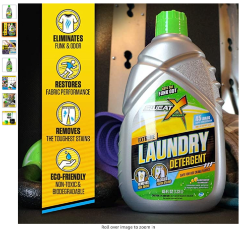
Most customers will never scroll down to the bullet points, which is why it is essential that you highlight the main benefits in your images to increase conversion.
Have a look at the product image below:

Mobile and desktop experiences are very different, which is why you should review your product on both the platforms such that you can optimise the titles and bullet points for more conversion.
- Let Your Customers See The Utility
You can improve the product images by utilising psychographic research that can help you to increase conversions.
By knowing your customers’ income, beliefs, and choices can help you make your images more compelling.
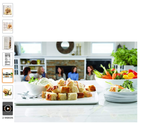
For example, if your customers are high-income group and you are selling coffee to these people, then you can use an upper-class kitchen in the background. While if your target customers are the middle-income groups, then using the middle-class kitchen would be more appropriate.
The important thing is to create an image of the product so that your customers can see how it fits into their lifestyles.
Here’s an example:

- No Novels
As we said that including infographics can be a powerful conversion tool but keep in mind that more text makes images less effective.
Think about senior customers who are looking at your product images, and if the text include is too small, they need to zoom in to read, this can be frustrating.
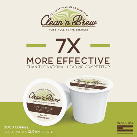
The best combination is to use a larger call of action mixed with a limited amount of smaller text so that your customers can get the information without straining their eyes.

Here is an example of how main phrases, along with additional text to highlight the main benefit can be effective at grasping customer’s interest.
- Avoid Photoshop Fails
Photoshopping your product images is nothing wrong, but there are some pitfalls you need to avoid.
Shadows: ensure that shadows fall where they are supposed to be else the image will look suspicious to the customers.
Scaling: if you are photoshopping props into the product images, make sure the images are to scale to provide the right perspective of the product size. The scale issues can cause not only returns but also restricted ASINs.
- Spell Check
Do not be alone punctuation and grammatical mistakes in the text on your images. Always check the copy with programs like Grammarly before adding the text to the images.
The poorly edited text conveys unprofessional aptitude.
- Follow Category Requirements
Apart from specific rules for images, Amazon also has specific rules that vary per category.
These rules are such that customers are provided with the most accurate information about the product like nutritional labels on supplements, the placement of shoes or the use of mannequin.
Always recheck the style guidelines every quarter as Amazon make changes without notifying the sellers.
- Exploit A+ content
Outside the image slots, you also have the opportunity to use images in the A+ content modules. We have often seen sellers repeating the same image from the image slots in the A+ content modules, and this is a huge mistake.
The images in the A+ content should highlight:
- Unique selling propositions
- Brand story, values and longevity
- Potential Use Case
- Instructions for use
- Additional Lifestyle Images
- Comparison Charts
Takeaway
Selling on Amazon can bring in profits by the bucket provided you know how to optimise your product listings with the right images to rank higher.
Including images that answer most of the questions that customers might intuitively have when buying these product will help your customers pick your products over your competitors.
That being said, there can be exceptions for implementing these tips. For example, you can be a company with large product mixes, so it is not cost-effective for you to fill all the image slots.
Sometimes adding too small text is the risk which is outweighed by the benefit of having all the information.
But in most cases optimising your product images for Amazon listing based on the above guidelines will help you boost the sales.

