Last Updated on July 11, 2019
Landing page and conversions go hand in hand or we can say they do if the landing page has been completely optimized and refined to improve every element. So irrespective of your business or goals, the main purpose of a landing page remains unchanged i.e. to convert. Ideally, you would want every page of your site to convert but landing pages require those extra efforts for improving its conversion rate.
Because you put in so much time and efforts creating a landing page, it should convert. Because you have carefully selected every headline, call to action and more, your landing page must convert. You have done your best to maximize the conversion rate and if you feel that your best efforts are still not enough, what is it that will help you to improve your conversion rate? You need to dig deep into it and know the ways through which you can increase landing page conversion.
While you may be getting the profit, your competitors may be figuring out ways of improvement, enhancing and building trust with their clients- just because their first impression must have been more impressive than yours. But don’t worry. There is still time for improvement.
Before going into the ways using which you can improve your landing page conversion rate, you need to know the facts.
Fact: Your biggest conversion gains will not come from new ads that you create, they will come from your landing page.
Fiction: Landing page testing is expensive and a lot tougher along with the fact that it is too much time-consuming.
So, now when you have an idea as to why the landing page is essential for better conversions, let’s tell you how you can improve your landing page conversion rate. Read below for the top 11 ways for increasing your landing page conversions:
Know your goals

Your goal is obvious i.e. to increase the conversion rate. But the biggest problem with many landing pages is the fact that they lack focus on a particular goal. A lot of landing pages have different offers that confuse the users and make them lose interest in the page. So it is important to create a landing page that focuses on one offer or solution and this way, your customers will not get confused.
Make simple yet straightforward headlines
You need to face it that you have just a few milliseconds to make that impression in front of the visitor. So it is very much important that your headline should be bold and clear. Solve a problem in your headline. And try to give them a solution too.
Also, does your headline go well with what your ad is saying? If you think it does not, check the headline again and correct it. Use title case for the headlines and subhead case for subheads. You can also try starting it as a question like “want more conversions in a budget?” etc. When it comes to creating catchy headlines, use words that sell like discover, unveil, guaranteed, free, quick, results, secrets, uncover. You can also try adding some humor if you think you will be good at it.
Make your first sentence a hit
Though every sentence you write in your landing page matters; there are these 2 sentences that matter the most- the opening line and the closing sentence. These are the ones that you hook the reader with. So it is advisable to keep the first sentence compelling, concise and to the point. Read and reread the first sentence of your landing page till you think you are much convinced about it. Edit it if you are not that satisfied. Does it compel you to read the whole page? If it doesn’t, just remove it and write again.
Use correct images
Content is the king without a doubt but images help to bring out essential emotions and to make the users take some action. It is crucial that all images used in the page from the header to those that are used in between the content are in sync with the text and make your message stand out in front of the reader.
Keep away the distractions
Flyers, pop-ups, sidebars, and too prominent share buttons are the biggest distractions. You need to ditch these and try not using them. Your landing page is created with one goal in mind- anything that doesn’t directly contribute to the goal is a total distraction and should not be there.

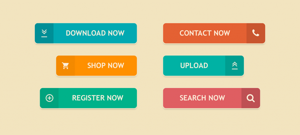
CTAs or call to actions are the crucial elements of any landing page as they are required to get users to take some action. It may seem like a button only but everything about it matters to make the users take a call. To the marketers, CTA is everything. In case no one clicks it, the business goes down and it is then your fault not to make it clickable enough.
So, let’s get started as to how you can do this-
- Use attractive language in your CTA copy like- buy, start now, download, get started, join, etc
- Make the language stand out from the rest of the landing page
- Add a sense of instant gratification
What about color?
Ensure that the CTA button contrasts with the color in the background. It is observed that generally blue, green and orange CTAs work great.
Message
It is the actual message that emphasizes the importance of a CTA. Try instilling some urgency or need for a particular product/service to improve the conversion rate.
Size
Ensure that the button size is not so small that the users cannot see it properly or so big that it distracts them away. It should be a perfect size and in sync with the overall layout.
Give them an offer they can’t deny
Generally, you give your readers some sort of bone on the landing page- like a free eBook, cheat sheet or guide. But ensure that you give something that they will like.
Include a review or testimonial

People care a lot about what other people think. So, an unbiased, genuine testimonial on the landing page will do more than any scripted stories or experiences. Try to include real testimonials from real-time customers only.
Optimize content for mobile

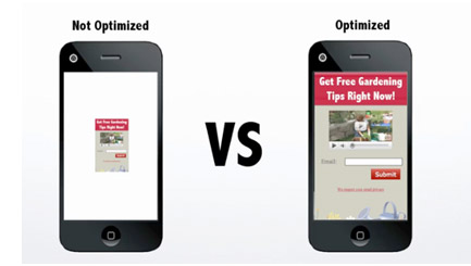
2017 observed mobiles overtaking desktops as the main traffic source and that continued in 2018 and 2019 as well. Obviously, the ratio varies across different industries and niches but this rise in mobile traffic brings in a high bounce rate on the sites that are not optimized for mobile users.
Using nice and bold imagery is good for desktop versions to make the site look more visually appealing. But this gets multiplied on the mobiles where too much text in a small space distracts the users.
So, to increase the conversion rate on mobile devices, you have to keep things clear and simple, including only that content which is essential for the landing page and drive sales.
Test everything before making it live
One thing which conversion optimization specialists and growth experts share is the deep love for testing. That is, in fact, the best way to know if a page is working or not and if not, then what needs to be fixed. When creating a landing page, test everything like the headlines, subheads, images, layouts, and content. It is through testing only that you gain important data to use towards improvement in the future.
Be sure that you use statistically significant testing ways so that you can trust the results. Also, have a process in place that helps to prioritize which test to run next. With restricted traffic, budget and time, it is crucial to test things that have the best chances of making a big impact.
Check the loading time

You can spend hours creating that perfect landing page with the right images and text but all this goes in vain if the loading time is high. So, it is mandatory for your page to load within a few seconds only else your user will say goodbye to you in no time. To reduce the page loading time, there is Google PageSpeed Insights that gives you the required suggestions. Ensure that you fix issues that it shows not just to improve the page speed but even to help in SEO.
Conclusion
Whether your landing page is performing average, miserable or exceptionally good, never settle for what you have at the moment. Keep refining them as for every percentage point, your conversion rate increases and your revenue improves even more. Optimize, test, refine, repeat till the time you are not satisfied with your final landing page.
Hope our information was useful in knowing how to improve your landing page conversion rate. Use these tips and you will see your conversion rate increase in no time.

